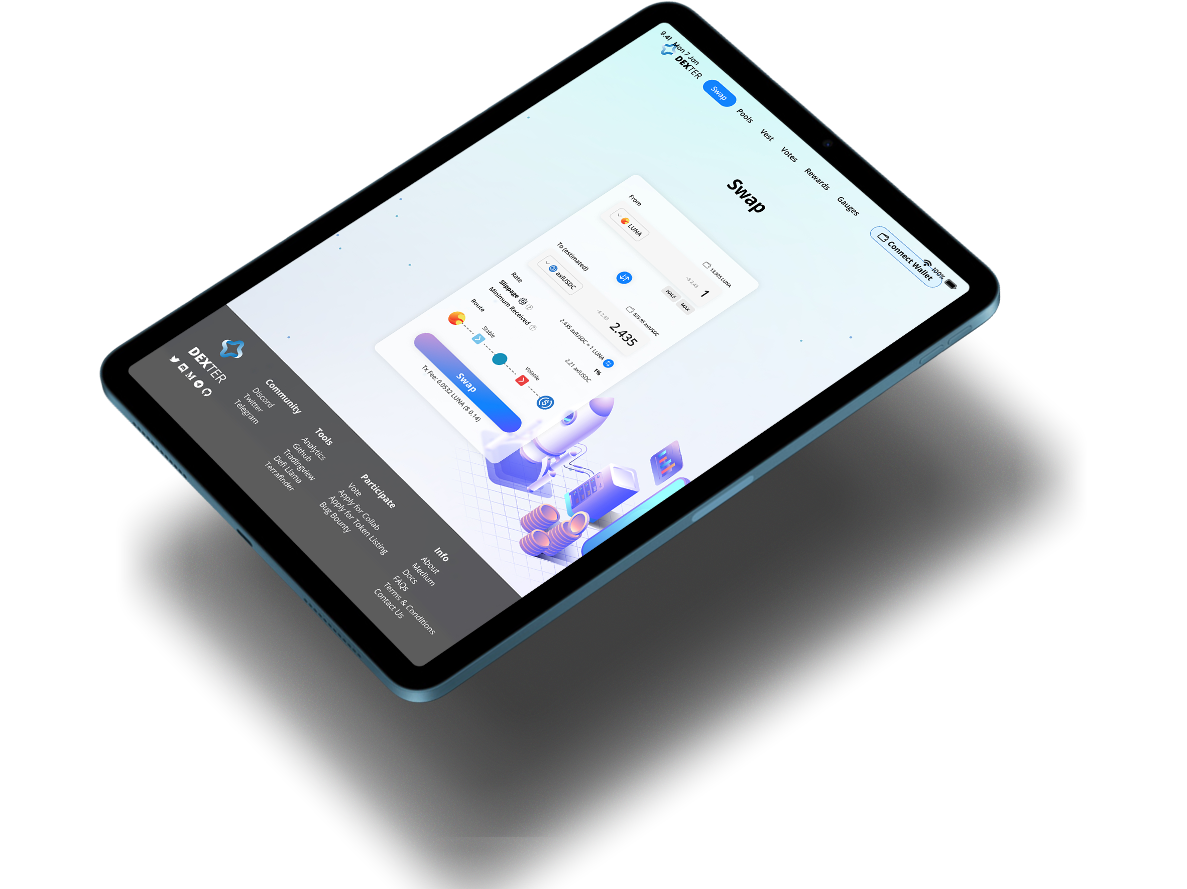
A decentralized exchange based in the Terra Ecosystem.
Timeline
November - December 2022 (4 weeks)
Role
Solo, UX Research, UI design
Stakeholders
DEXTER.Money
INTRODUCTION
Overview
Dexter is the first decentralized exchange (DEX) on Cosmos that aims to provide low slippage and deep liquidity for token pairs that are paramount for the growth of Terra, while benefitting protocol owners by enabling efficient incentivization through bribes and gauges and a flywheel tokenomics model for the DXTR token.
Problem
Most blockchain and cryptocurrency technologies tend to be complicated and pose as a huge hurdle for non-native users to adapt. Language and terminology typically used like “tx hash” and “gas fees” can sometimes seem like gibberish especially to new users. Unstable and fluctuating currencies also means that users can’t make decisions efficiently.
Solution
Robust yet simple and clutter free interface to improve user experience.
Sufficient tooltips and error prompts to help with decision making.
Simplified slippage tolerance and amount input selection to improve efficiency of trading process.
COMPETITIVE ANALYSIS
Identifying PATTERNS amongst existing DEXes and DEFI platforms
International payment gateways and mobile banking solutions are playing crucial roles in making a cashless world a reality. With the pandemic helping to further advance this cause.
Basic budget apps typically connect with your financial accounts, track spending and categorize expenses so you can see where your money is going. But many apps do much more than that.
Below we look at a few companies that accomplishes these functions.
Displaying wallet balances
It is always crucial to allow users the ability to know what their token balances are at all times. This enables users to make quicker decisions without having to resort to additional windows opened to view their balances.
To take it 1 step further, the word “balance” could easily be replaced by a wallet icon to reduce visual clutter.
Error messages and troubleshooting
With various complex steps and requirements required to sometimes make a simple transaction, like having minimum balance or having sufficient amounts for transaction fees, error messages and how and when they are displayed becomes an essential part of the interface and greatly affects user experience. Pain points caused by lack of information can easily deter users.
Converting and displaying USD value of tokens
The value of crypto currencies are constantly fluctuating and with so many users may sometimes deal with multiple currencies at once that are all priced differently. It is therefore important to always portray the USD value of the currencies involved at all times. Some may even opt to utilize a hover tool tip option but these usually involves an extra step for user and sometimes users may not even be aware of this function.
Displaying all information well
With so much information to display in even for the most simple function (swap), the way in which these information are portrayed are therefore essential to make the method of delivery as clear and as methodological as possible. An array of design systems and hierarchies should be deployed to aid in this as much as possible.
USER INTERVIEWS & MAJOR INSIGHTS
Good User experience in web3 is not about the average case, it is about the worst case.
A UI that is clean and sleek, but does some weird and unexplainable thing 0.723% of the time that causes big problems, is worse than a UI that exposes gritty details to the users but at least makes it easier to understand what’s going on and fix any problem that does arise.
Below we look at the most common responses by users.
IDEATE
Mapping out the information architecture
With such a complex system and information, it was crucial to map out the user flows to ensure that users are making decisions and making their journey through the platform as efficiently as possible.
THE DESIGN
Wireframes
Based on findings that have been obtained so far, I then took the next step of putting pen to paper. This process began by sketching low-fidelity and drafting medium-fidelity wireframes.

BEING ON BRAND
The Style Guide
I decided to use Poppins font for its simplicity, clarity yet modern design character. When selecting the color scheme, my biggest inspiration was the ability to portray trustworthiness. The scheme has been applied throughout the platform in a consistent manner to reinforce brand.
THE FINAL DESIGN
High-fidelity wireframes
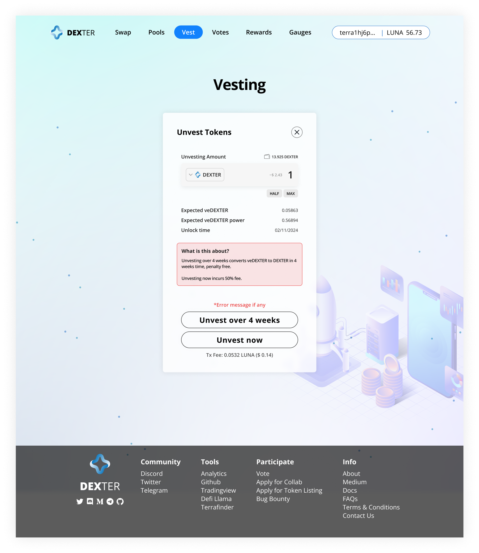
The final design embodies all of the research that has been done and brought forth feature that best suit the stakeholders brief as well as design aspects that provides for the best user experience. The brand style has been applied to pair with the UI to bring to the user a consistent design system.

PROTOTYPE
Check out the prototype and try out the platform!
CONCLUSION + LESSONS
What I would do differently next time.
I was lucky to be able to work on this UX project with a client that shares the same passions as me. I am immensely grateful to have been able to go through the entire UX process with this client and experience the many ups and downs of working with stakeholders. On that note, here are a few things to take away:
Get more feedback, even through earlier stages. Even when at stages where it seems like there be not much to get feedback from, it always never hurt to get a different perspective. Some feedback on earlier stages may actually change the entire outcome of the project.
Don’t reinvent the wheel. Some things are just tested and proven to work. Especially in UI aspects, don’t try to be over ambitious to try something new. But even if you tried and you end up at the same place, at least you got a better understanding of why things are as such.
Balancing user needs vs client needs. Hey, sometimes they clash. But it’s your job to maintain that balance. Try to make the client see the business benefits of emphatisizing with the user and how that might reward them later on.
Document EVERYTHING. This is something I always have to remind myself. We sometimes get too caught up in the process , we forget that documenting them is just as important. I’ve made it a point to document as much as possible in this project. But a reminder is always good.


