Slow Living Studios
Enhancing the user online furniture shopping experience.
Timeline
November - December 2022 (4 weeks)
Role
Solo, UX Research, UI design
Stakeholders
Aliana, Hassan, Sam
INTRODUCTION
Overview
Slow Living Studios (SLS) is a Singapore based home living and furnishing brand. SLS prides itself in not just crafting high quality products but also curating certain experiences through thoughtful and purposeful spatial design to slow down the pace of metropolitan Singaporean life.
Problem
SLS is a primarily online based SME. Being a start up, SLS does not have any physical gallery or studio space to allow for live viewing of their products. There a major challenge would be to allow SLS to convey ideas and products online successfully in a way that is convincing and trustworthy, especially when furniture may be considered as big ticket items.
Solution
Easy and accessible information about product, shipping and returns.
Clear and abundance of customer reviews.
User ability to visualize product in their own home.
Styling suggestions for common functions of the home.
COMPETITIVE ANALYSIS
CUSTOMER REVIEW is an important feature for furniture shops with no physicial showrooms.
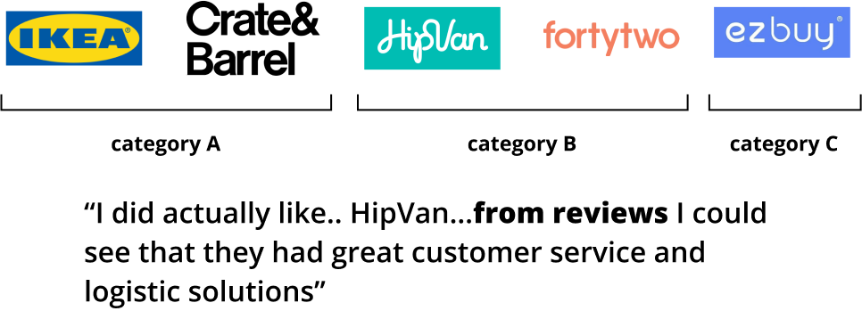
I conducted a research amongst 5 furniture companies that can be categorized into 3 main categories.
A. Large businesses with multinational presence and large retail presence.
B. Local businesses with online only store. No retail presence.
C. Indirect competitors that exist as a general marketplace which have furniture and home living wares listings direct from suppliers.
I found that on top of customer reviews, another differentiating factor between companies in Category A and those in category B & C was the availability & accessibility of online customer help.
The clear standout feature, however was the AR/VR feature, the ability for users to visualize the furniture in your own home. This feature is only available in HipVan and IKEA, which leads to an assumption that it is a valued feature even for an established MNC as it is something that cannot be achieved even with retail showroom. This was therefore an opportunity which i sought to explore further.
USER INTERVIEWS
Interviewees surprisingly were MORE SATISFIED purchasing online than in-store.
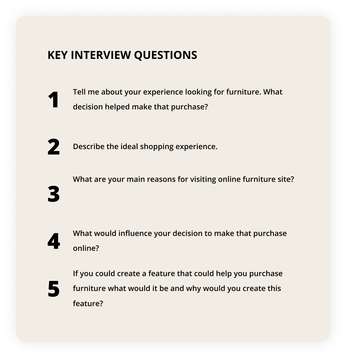
The main objective of user interviews would be to identify the pain points and motivations relating to furniture shopping in general, in-store and online. The next objective was to identify motivations and factors affecting online furniture purchase. Lastly would be to identify potential opportunities and confirm them through the interviews and surveys.
MAJOR INSIGHTS
User experience that is unavailable in-store provides for GREAT OPPORTUNITY.
After going through all user interviews, surveys and collecting hundreds of data points, below is a summary of data organized via affinity mapping to identify common factors. The outcome of the research was rather unexpected. Most intervewees associated more pain points in relation to physical furniture shopping and 86% of survey respondents expressed interest in shopping for furniture online.
“I research IKEA products online before purchasing... honestly could have bought from IKEA online. I just had to go to the store to feel and affirm my decision”
USER PERSONA
IDEATE
Constructing the user journey
The user flow takes us through the journey of a typical user and the decisions they make along the way. By mapping this out, we are able to streamline unnecessary steps and make the user journey as smooth as possible.
THE DESIGN
Wireframes
Based on findings that have been obtained so far, I then took the next step of putting pen to paper. This process began by sketching low-fidelity and drafting medium-fidelity wireframes.

BEING ON BRAND
The Style Guide
I decided to use Open Sans font for its simplicity, clarity yet modern design character. When selecting the color scheme, my biggest inspiration was the natural tones of wood furniture. The scheme has been applied throughout the platform in a consistent manner to reinforce brand.
THE FINAL DESIGN
Key features of the final design
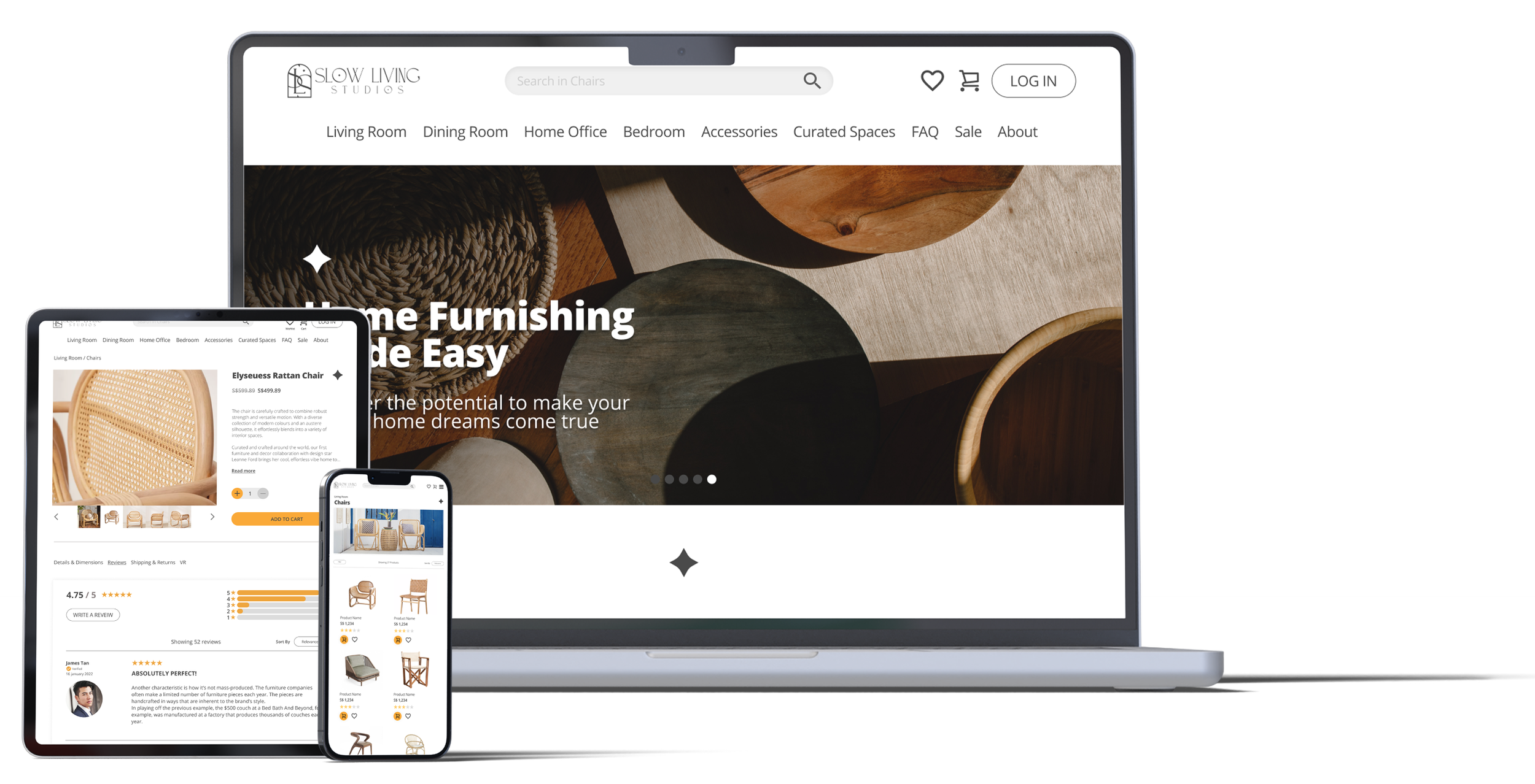
The final design embodies all of the research that has been done and brought forth features that is in line with the typical user persona. The brand style has been applied to pair with the UI to bring to the user a consistent design system.
PROTOTYPE
Check out the prototype and try out the platform!
CONCLUSION + LESSONS
What I would do differently next time.
I was lucky to be able to work on this UX project with a client that shares the same passions as me. I am immensely grateful to have been able to go through the entire UX process with this client and experience the many ups and downs of working with stakeholders. On that note, here are a few things to take away:
Get more feedback, even through earlier stages. Even when at stages where it seems like there be not much to get feedback from, it always never hurt to get a different perspective. Some feedback on earlier stages may actually change the entire outcome of the project.
Don’t reinvent the wheel. Some things are just tested and proven to work. Especially in UI aspects, don’t try to be over ambitious to try something new. But even if you tried and you end up at the same place, at least you got a better understanding of why things are as such.
Balancing user needs vs client needs. Hey, sometimes they clash. But it’s your job to maintain that balance. Try to make the client see the business benefits of emphatisizing with the user and how that might reward them later on.
Document EVERYTHING. This is something I always have to remind myself. We sometimes get too caught up in the process , we forget that documenting them is just as important. I’ve made it a point to document as much as possible in this project. But a reminder is always good.

