Thrific.
Revolutionizing Second-Hand Goods Shopping Experience.
Timeline
September - October 2022
Role
Solo, UX Research, Branding, UI design
Stakeholders
Thrific Inc.
INTRODUCTION
Overview
Moving in and out of a new place can be a very hectic and stressful experience. 80% of respondents agree that one of the key causes of stresses is getting rid of goods they no longer need or do not want to move with them. These usually end up being thrown or they attempt to sell it. However, in a city like Singapore where 85% of residents live in apartments, holding moving out or garage sales is not feasible.
Problem
Traditional methods of second-hand buying and selling like, garage sales and yard sales are not feasible in a metropolis. Thrift shops may help but it is a slow process and the moving process is usually a time sensitive process.
Solution
Connecting 2 groups of users, the buyer and the seller, to assist in finding a new home for second-hand goods.
Easy and straightforward process of searching and connecting these 2 users.
Detail search function and listings to connect buyers to the most ideal listing.
COMPETITIVE ANALYSIS
Commercial driven vs user driven.
The goal of this research would be to identify and better understand the problems encountered for buying and selling second-hand goods. We also want to empathize with users and create an understanding as to what makes for a positive second-hand goods hunting experience.
Through competitive analysis we will identify 4 companies that currently list and sell second-hand goods online. Through these companies we will identify what are the pain points associated with online second-hand goods shopping. At a glance, we can see that the most mature companies seem to gravitate towards a more commercial driven platform that is overly run by retail listings rather than peer-to-peer listings. As a result the communal aspect is lost and they appear more retail and clinical. However, good takeaways would be the efficiency of the site in terms of searching and listing which is a positive point for users.
USER INTERVIEWS
Who are the key players?
To emphatize with the user, we first have to understand who are the potential users. This user interview shortlisted 8 potential users who have recently moved and have engaged in second-hand buying and selling activities either online or offline. Through these interviewees, we would be able to better understand who the target audience are and design better through understanding their needs, motivations and paint points.
MAJOR INSIGHTS
Connecting demand and supply is key.
At the crux of the issue lies the two major players, the buyer and the seller, both with their own needs, motivations and goals. The seller wants to list their items in the most effective way whilst the buyer needs detail information to make informed decisions about the item they are buying. They key then lies in how these two motivations are connected to achieve the common goal.
USER PERSONAS
The move-out seller and the sentimental antiques hunter.
IDEATION
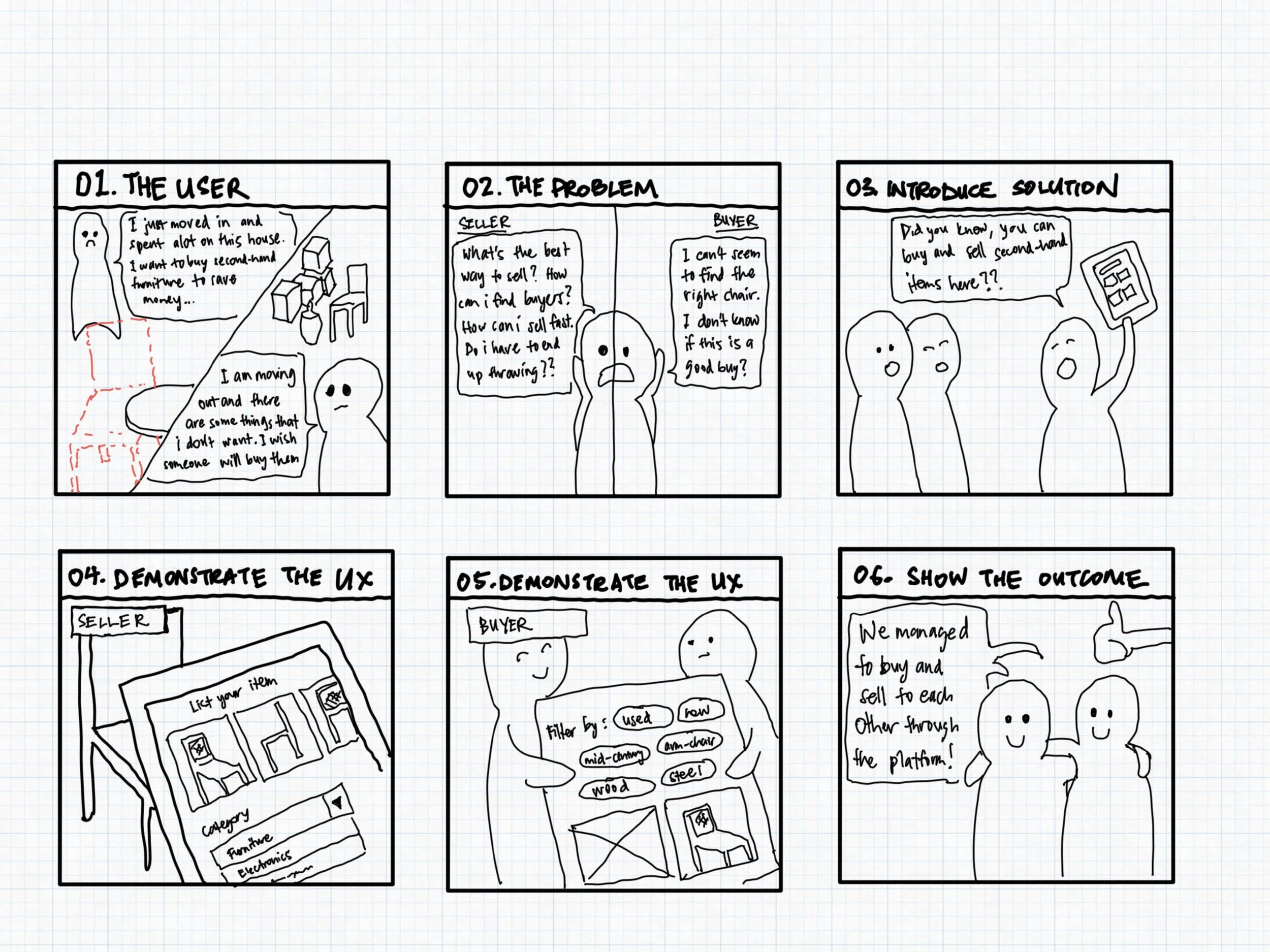
Illustrating the story.
The best way to align with stakeholders and developers is simply through a storyboard. Here the agreement would be to provide a mobile app platform to connect buyers and sellers to help them achiever their goal of buying or selling their second-hand goods.
INFORMATION ARCHITECTURE
Mapping out user journeys.
The user flow takes us through the journey of a typical user and the decisions they make along the way. By mapping this out, we are able to streamline unnecessary steps and make the user journey as smooth as possible.
LOW AND MEDIUM FIDELITY WIREFRAMES
Putting pen and paper onto the screen.
Having gathered essential data and organized these information through informational architecture (IA), we then started sketching out possible outcomes for the platform through low and mid-fi wireframes.
BRANDING & UI DESIGN
Bringing the brand to life.
Designing the branding was part of this project brief. Before embarking on any visuals, it was important to highlight the brand values and start with literary inspirations first. From there, the primary colours were chosen for their ability to portray elements of warmth and community to the brand. The logo elements on the other hand reminds us of the roots of thrift shopping, filtering through things and checking out price tags to see if it is a good bargain.
THE FINAL DESIGN
High-fidelity wireframes.
The final design is a combination of all information and research data obtained and crafted through information architecture combined with consistent brand values in mind. A key element that was important was to always ease the process for both users and make their connection as seamless as possible.
USABILITY TESTING
What worked and what didn’t.
We conducted a usability test with 5 participants to identify gaps in the design. This also provided with much opportunities for improvement.
PROTOTYPE
Check out the prototype and try out the platform!
CONCLUSION + LESSONS
What I would do differently next time.
This was the first case study that I worked on in UX Academy and although this may not be an actual client, it was an issue which I was truly passionate about having to move around a lot and through user interviews find that such a platform is much needed. I therefore allowed me to truly empathize for these users and provided with much motivation:
Never assume. Allow the research to steer the result. As I was emotionally invested in this project as well, as a designer we sometimes already have the end product in mind. I learnt however that it is important to allow the UX research to steer the direction as much as possible and not allow assumptions to influence it. Outcomes aren’t always what you expect.
Using the right tools. There are so many frameworks and tools to be used in UX design and it is always important to use the right tools that is apt for your project. But you never know until you try them all so, keep practicing :)


